
Experiment analytics
The Result tab shows how each variant is performing against your hypothesis, with exposure charts, a metrics table, and a drill-in view for the full statistical breakdown.
Overview
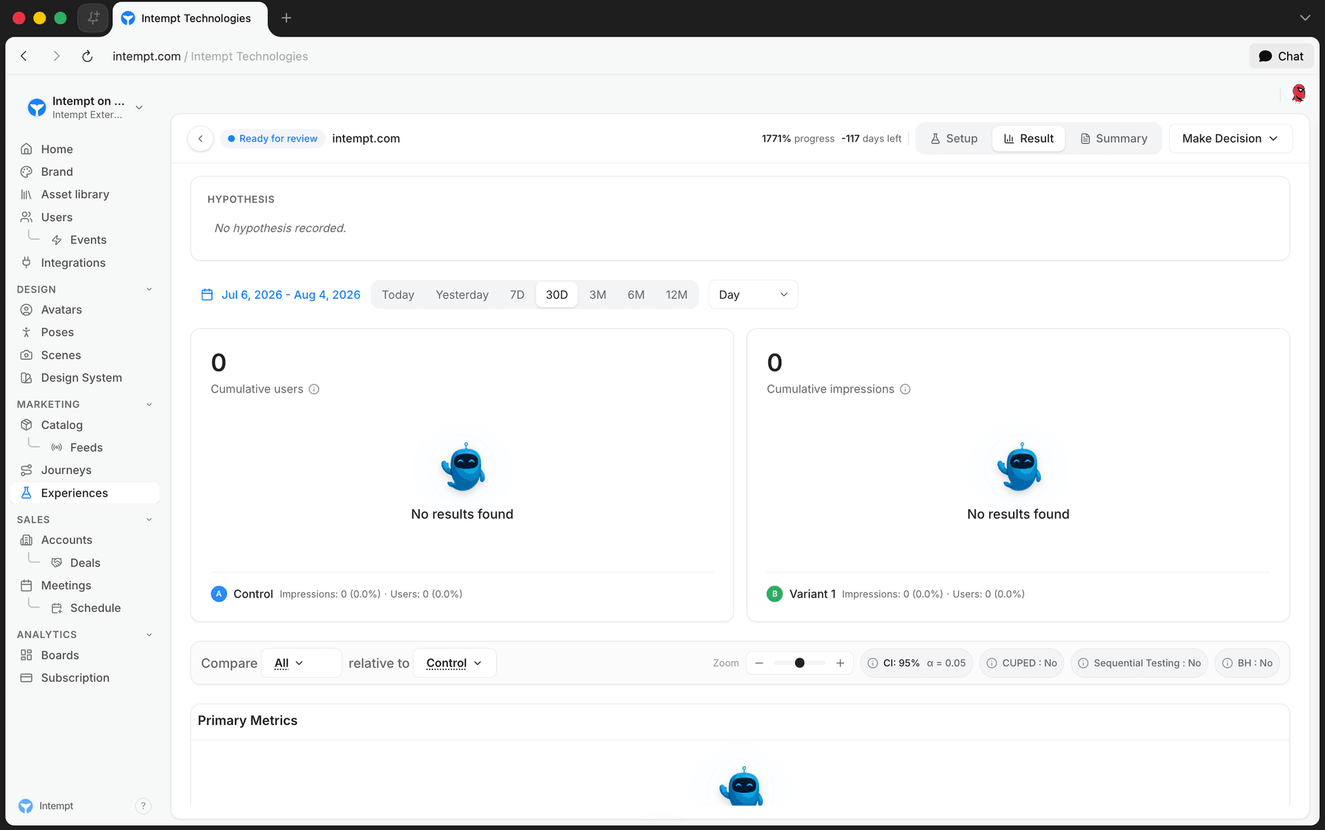
Every experience has three tabs: Setup, Result, and Summary. The Result tab is where you read experiment performance: the hypothesis, exposure over time, and a metrics table you can open for the full statistical detail on any metric.
📘 Good to know
There's no separate "Metrics" navigation item for experiences today. Editing the hypothesis and reading results both happen inside the Result tab described below.
Hypothesis and decision
1. Hypothesis
The hypothesis card sits at the top of the Result tab. Hover it and select the pencil icon to edit the hypothesis inline. The field accepts up to 500 characters; press Enter or click outside the card to save.
2. Make a decision
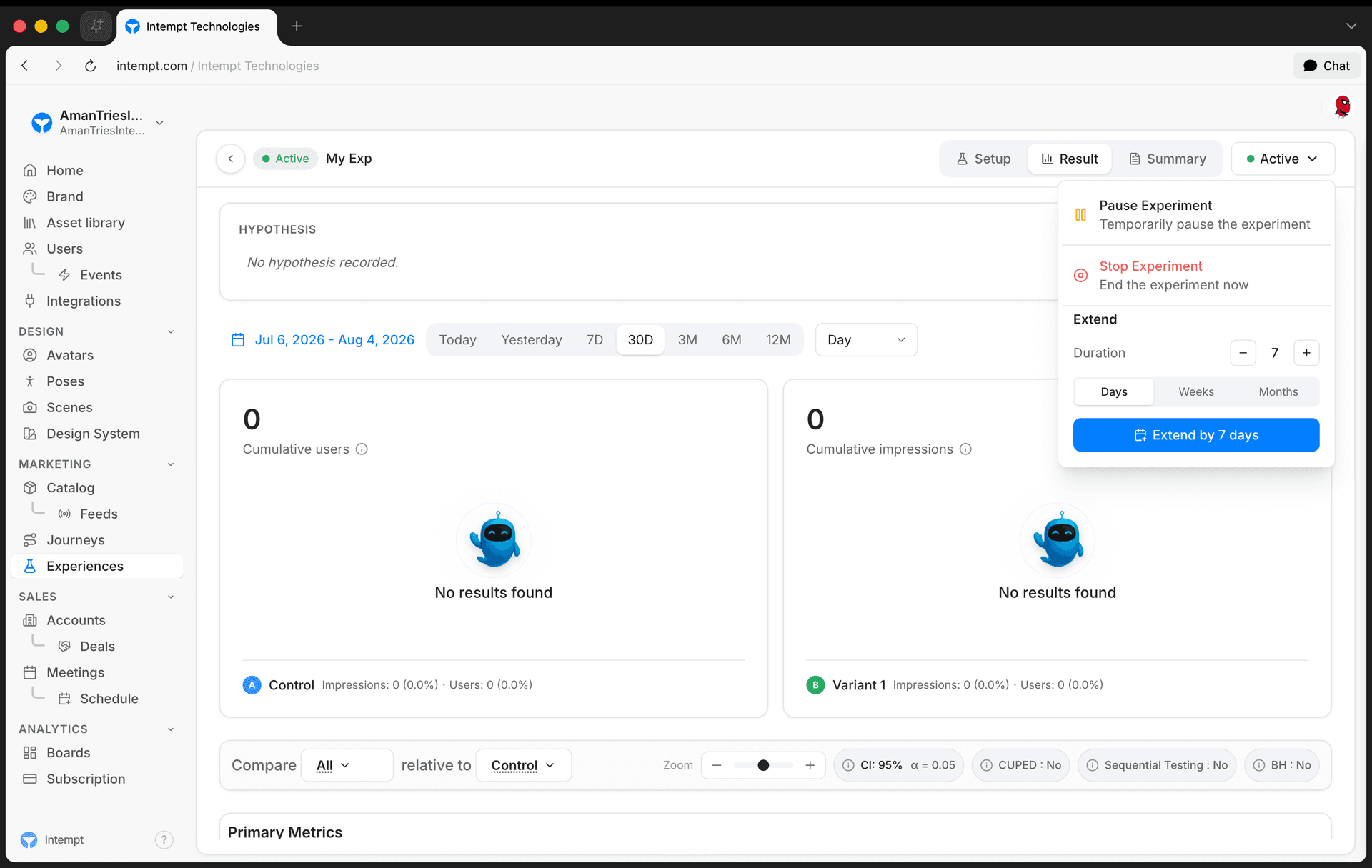
The header shows progress (percent complete) and days left, plus a decision control next to them:
-
Make Decision: shown while the experience hasn't started or has stopped. Opens Start Experiment or a disabled Stop Experiment action.
-
Active: shown while running. Opens Pause Experiment or Stop Experiment.
-
Paused: shown while paused. Opens Resume Experiment or Stop Experiment.
-
Extend: available whenever the experience isn't stopped. Set a count and a unit (days, weeks, or months) and select Extend to push out the end date.
The decision control is disabled, with a tooltip explaining why, until the experience has a target website URL configured.
Exposure
1. Date range and grouping
Above the exposure charts, a date range switcher sets the window for the whole Result tab, and a group-by selector controls how the charts and metrics table bucket data: Day, Week, or Month (experiences don't offer a Year grouping).
2. Cumulative exposure
Two area charts show, per variant:
-
Cumulative users: total number of users assigned to each experimental group over time. Balanced exposure across variants is what makes the results below valid.
-
Cumulative impressions: total number of impressions (views) per variant over time.
Below the charts, a breakdown lists total users and total impressions for each variant, including Control.
Comparing variants
A control bar above the metrics table sets how every metric in the table is compared:
-
Compare: the variant (or All) whose results you're viewing.
-
relative to: the baseline variant it's compared against.
-
CI: the confidence level used to compute results (80%, 85%, 90%, 95%, 98%, or 99%), shown together with its alpha value.
-
CUPED: toggles CUPED variance reduction, which uses pre-experiment data to improve statistical sensitivity.
-
Sequential Testing: toggles sequential testing, which allows early stopping once results are conclusive.
-
BH: toggles the Benjamini-Hochberg procedure, which controls the false discovery rate when testing multiple metrics at once.
A zoom control next to these toggles rescales the metrics table's effect-size bars without changing the underlying data.
Metrics table
Metrics are split into two tables, Primary Metrics and Secondary Metrics. Each row shows, per variant:
-
The variant name (or Control), colored to match its series in the exposure charts.
-
An effect bar plotting the relative delta and its confidence interval on a shared scale, colored green, red, or neutral depending on whether the result is significant.
-
The relative delta and its confidence interval as text (for example,
+4.20%±1.10%).
Select the file icon next to a metric's title to share it. Shared metrics also appear in the Summary tab described below. Select any bar in the table to open that metric's full detail view.
📘 Media pending
Screenshot/video for this section hasn't been captured yet.
Metric detail view
Selecting a metric's bar opens a detail panel with three tabs.
1. Summary
A banner states the call: Ship It, Don't Ship, or Keep Running, alongside the lift, p-value, and sample size for that variant, plus the 95% confidence interval.
Below it, a table breaks the same result into three rows: Experiment Lift, Daily Topline Impact, and Daily Projected Impact, each with an absolute and a relative value and its interval. Two cards report Effect Size (Cohen's d) and Yearly Projected Impact.
2. Time Series
A day-by-day chart tracks how the treatment effect evolves over the experiment's duration, alongside its configuration (date range and confidence level). Use it to check whether a novelty effect is fading or whether the result is stabilizing.
3. Methodology
When CUPED is active for a metric, a card reports the percentage of variance reduced and the covariates contributing to it, with an expandable explanation of CUPED and the sequential testing method (mSPRT) it's paired with.
Below that, a variant comparison table lists, per group: Users (number of users), Mean (average value per user), Total (sum), and SE (standard error; lower means a more precise estimate), plus the delta between variant and control.
📘 Media pending
Screenshot/video for this section hasn't been captured yet.
Summary tab
The Summary tab is a read-only, shareable view of the same experience: its status and dates, hypothesis, a per-variant exposure breakdown, the same compare controls, and the Primary and Secondary metrics tables, limited to whichever metrics you've marked as shared from the Result tab.
Where to go next
CUPED
CUPED (short for Controlled Experiment Using Pre-Existing Data) is a technique that uses what you already know about a user from before an experiment to reduce the variance and increase confidence in experiment...
Experiences Overview
An Experience is Intempt's container for testing and personalizing your site or app. Four types, two stored fields.