
Design Systems Overview
Design System is Intempt's reusable visual style library: seed color, typography, corner radius, elevation, and component styling, previewed live and applied wherever a design is picked.
Overview
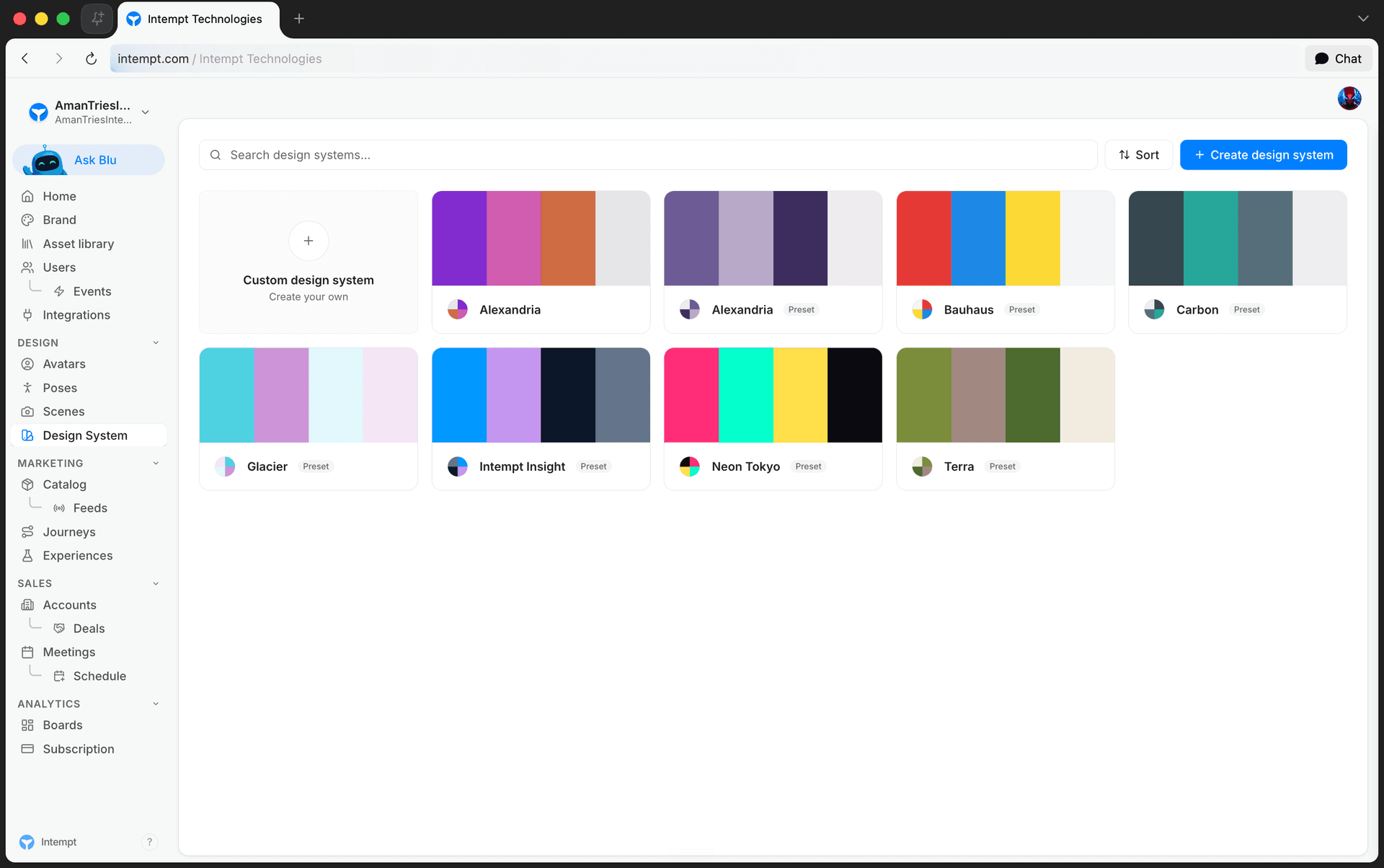
Design System lives under Design in the console sidebar (/design-system). It's a library of reusable visual styles: color palettes, typography, corner radius, shadow levels, and component styling, that you build once and reuse anywhere a design gets applied. The page combines your own custom design systems with a set of built-in presets in one list.
How it works
Browsing your design systems
The list combines built-in presets and your custom design systems into one view. You can:
- Search by name.
- Sort by "My design systems first," "Presets first," "Recently updated," or "A → Z."
Each card shows a small color-circle preview of the design's palette, its name, and, for presets, a "Preset" badge. If a search matches nothing, the list shows "No design systems match."
Creating a design system
There's no blank form for building a design system from scratch. Every creation path opens Blu, Intempt's AI chat panel, scoped to design:
- The "Create design system" button opens a panel with "Generate with Blu" (opens chat with no pre-filled text) or "Upload file" (accepts
.mdor.txtfiles), plus a Continue button. - A dashed "Custom design system" tile at the front of the grid opens chat with the prompt already filled in: "Create a new design system from scratch. I'll describe the brand style I'm going for."
- Uploading a file opens chat with the prompt "Create a design system from the attached DESIGN.md file."
Either way, you describe the style in chat and Blu generates the design system record.
The design system editor
Opening any design system splits the page into two panels. The left panel is a live preview of the palette, typography, components, and elevation; the right panel is a Theme editor with a toggle to a read-only DESIGN.md view showing the design's markdown source, auto-generated from every field.
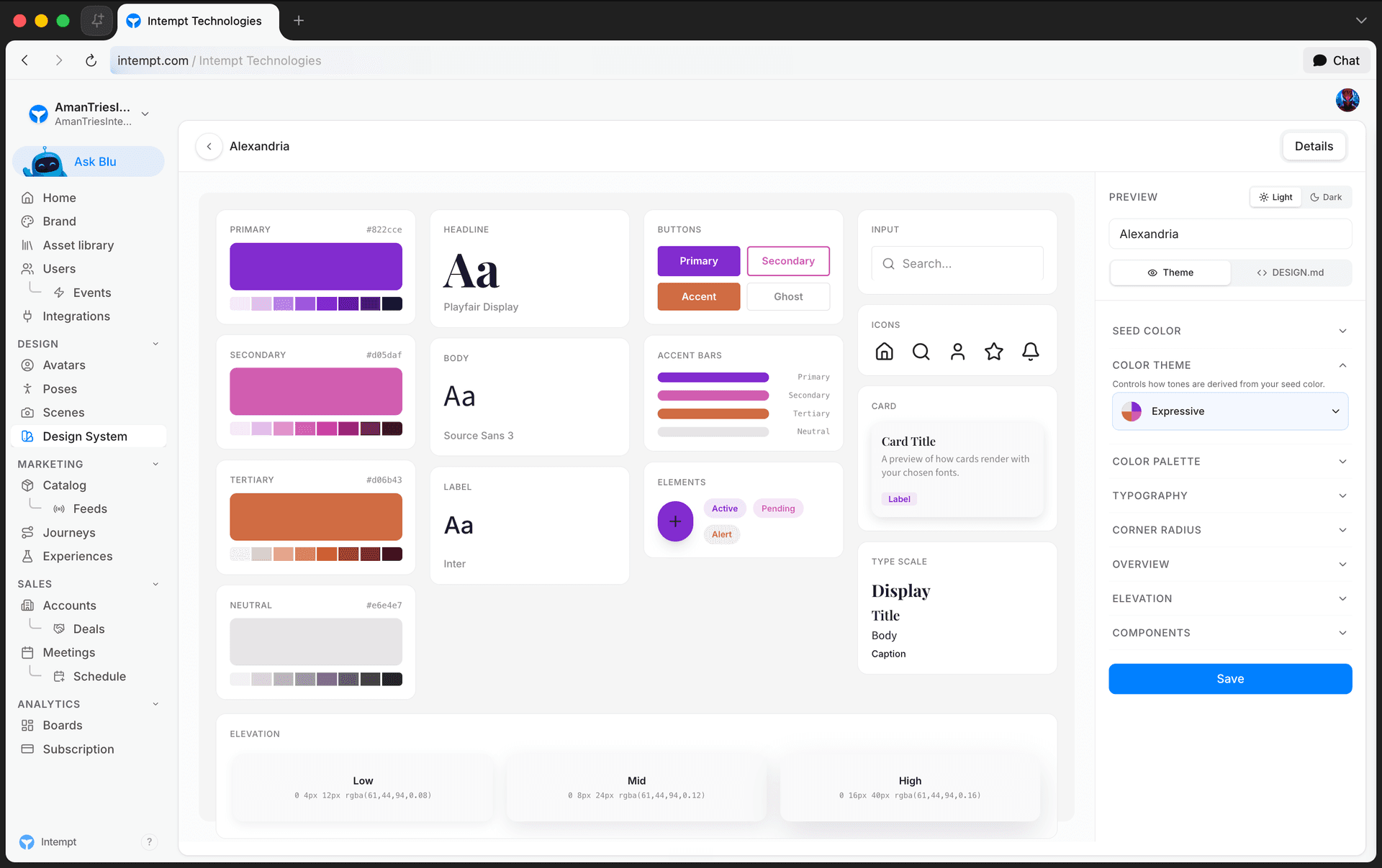
On the Theme tab:
- Seed Color: the source color the rest of the palette generates from. Disabled once the color theme is set to Custom.
- Color Theme: one of 8 algorithms that derive the palette from the seed color: Tonal Spot, Vibrant, Expressive, Content, Neutral, Monochrome, Fidelity, or Custom.
- Color Palette: the four derived roles (primary, secondary, tertiary, neutral). Editing any swatch directly switches the color theme to Custom.
- Typography: three font slots (Headline, Body, Label), each pickable from a categorized font library or set to any custom font family.
- Corner Radius: four preset roundness levels, from square corners (0px) to the roundest preset (16px), that control the roundness of buttons, cards, and inputs across the preview.
- Overview: a free-text description of the design system.
- Elevation: named shadow levels, each with a CSS box-shadow value and a usage note (for example, "cards, dropdowns"). Add levels freely; you can remove one as long as at least one level remains.
- Components: style pickers for Buttons (Filled or Outline), Cards (Elevated, Bordered, or Flat), and Inputs (Outlined, Underline, or Filled).
The preview panel toggles between light and dark, and clicking any preview section (colors, typography, elevation, components) jumps the sidebar to that section.
📘 Good to know
Three Components options aren't confirmed to save correctly: Buttons' "Outline," Cards' "Bordered" and "Flat," and Inputs' "Underline" don't match the value the backend expects for that style. The editor lets you pick them, but what happens after you save one hasn't been verified end-to-end yet.
Presets, custom systems, and Remix
Built-in presets show a "Preset" badge and can be opened and edited like any other design system, but saving a preset never overwrites it: it forks your edits into a new custom record instead, using whatever the name field holds at save time. If you haven't changed the name field, the fork gets the exact same name as the preset (the "Preset"/"Custom" badge is what tells them apart); clearing the name field entirely falls back to the preset's name with "(Custom)" appended.
A Remix button on any preset skips editing entirely: it immediately creates an editable copy with "(Remix)" appended to the name and takes you to it. Deleting is only available on custom design systems, not presets.
Use cases
- Standardizing visual style across every generated asset. Build one design system and apply it everywhere a design is picked, instead of restyling each piece of content by hand.
- Starting from a preset instead of a blank brief. Remix a built-in design system into your own editable copy rather than picking a seed color and theme from scratch.
- Matching an existing brand palette exactly. Switch the Color Palette swatches directly to override the generated tones, which automatically moves the design to the Custom theme.
- Bringing in an existing design brief. Upload a
.mdor.txtDESIGN.md file instead of describing the style in chat. - Auditing what's built-in vs. custom. Filter by source to separate your own design systems from presets before deciding what to remix or delete.
- Defining shadow depth for a component library. Add named elevation levels with real CSS box-shadow values so cards, modals, and popovers each get a distinct depth.
- Previewing dark-mode compatibility. Toggle the editor's preview between light and dark before committing to a palette.
- Sharing a design system's source with a teammate. Open the DESIGN.md tab to see the full markdown representation Blu generates from the current fields.
Where to go next
- Brand Kit Overview – Identity's Default Theme setting reuses the same design themes as your message appearance settings.
- Avatars Overview – Design's other AI-generated library, for reusable brand characters instead of visual styling.
- Poses Library Overview – browse and remix built-in poses the same way you browse design systems.
Scenes Library Overview
Scenes is Intempt's library of photo-studio recipes: saved lighting, camera, and environment combinations you apply for a consistent backdrop across every product shot.
Setting Up a Design System
Browse, generate, and manually configure a design system's colors, typography, corner radius, elevation, and component styling from the Design Systems page.