
Setting Up a Design System
Browse, generate, and manually configure a design system's colors, typography, corner radius, elevation, and component styling from the Design Systems page.
Overview
A design system is a saved set of colors, typography, corner radius, elevation, and component styles that Creative Studio and other content surfaces apply to everything they generate. This guide covers the Design Systems page itself: browsing your library, creating a new design system, and configuring every field by hand in the editor. For the Blu Chat mechanics shared across Avatars, Poses, Scenes, and Design Systems, see Generating Brand Assets.
How it works
Design Systems ships with built-in presets alongside anything you create. Presets are read-only: opening one shows a Remix button instead of a delete action, and remixing duplicates it into a new custom design system named <Name> (Remix). Editing a preset's fields directly and clicking Save doesn't touch the preset either: it creates a new custom design system and switches you to it, using whatever the name field holds at that point. Since the name field starts pre-filled with the preset's own name, the fork usually ends up with the exact same name as the preset unless you change it yourself; only clearing the name field entirely falls back to <Name> (Custom).
Every design system is edited in a two-pane view: a live preview on the left that updates as you change fields, and a sidebar of editable sections on the right. Clicking a section of the preview itself (its colors, typography, elevation, or components) jumps the sidebar to the matching section automatically. A DESIGN.md tab next to the editable fields shows the raw markdown the backend generates from the whole record. It's useful for copying the definition out, not for editing it directly.
Getting started
Opening Design Systems
Click Design System under Design in the console sidebar (path /design-system).
Browsing your library
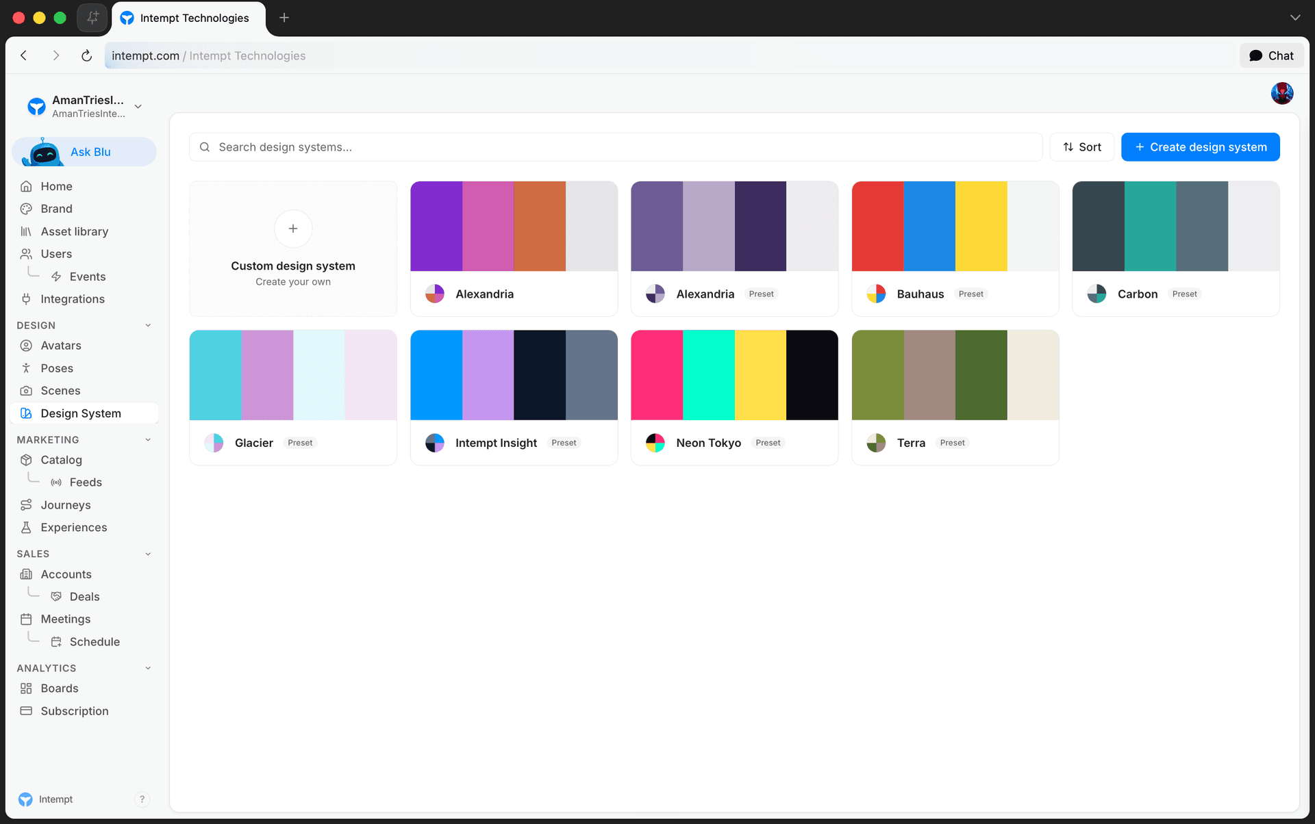
The Design Systems page lists your custom design systems and the built-in presets together.
- Search. Filters the list by name.
- Sort. My design systems first, Presets first, Recently updated, or A → Z.
Each card shows a four-color swatch preview and a Custom or Preset badge. Only custom design systems can be deleted; presets have no delete action.
Creating a design system
Click Create design system in the toolbar to open a panel with two options: Generate with Blu (describe what you need and let Blu create it for you) or Upload file (use an existing file from your computer). Pick one and click Continue. A dashed Custom design system tile also sits at the front of the grid; clicking it opens Blu Chat with the prompt "Create a new design system from scratch. I'll describe the brand style I'm going for." already sent. All routes hand off to Blu Chat; see Generating Brand Assets for what happens once Blu has your description.
Once Blu creates the design system, open it to review or refine every field yourself in the editor below.
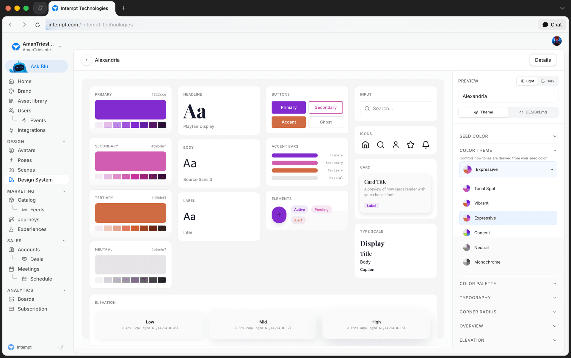
Setting the seed color and color theme
Open a design system to reach the editor. In the sidebar:
- Seed Color. The source color the rest of the palette derives from: a saturation/value picker, a hue slider, and a hex input. Disabled once Color Theme is set to Custom.
- Color Theme. One of Tonal Spot, Vibrant, Expressive, Content, Neutral, Monochrome, Fidelity, or Custom. Changing the seed color regenerates the four derived colors under any theme except Custom.
Adjusting the color palette
The Color Palette section lists the four derived roles: primary, secondary, tertiary, and neutral. Click a role to expand its color picker and override the hex directly. Editing any swatch by hand switches Color Theme to Custom, since the palette is no longer purely generated from the seed color.
Setting typography
The Typography section has three font fields: Headline (titles), Body (paragraphs), and Label (buttons and UI). Each opens a categorized list of Google Fonts to pick from, plus a text field to type in a custom font family and add it with Add.
Choosing corner radius
Corner Radius sets the roundness of buttons, cards, and inputs. Pick from four preset values, shown as icon buttons ranging from square corners (0px) to the roundest preset (16px).
Writing an overview and configuring elevation and components
- Overview. A free-text description of the design system.
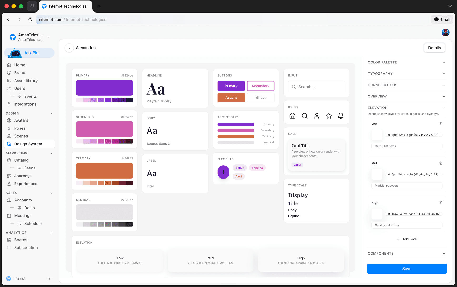
- Elevation. A list of shadow levels, each with a name, a CSS
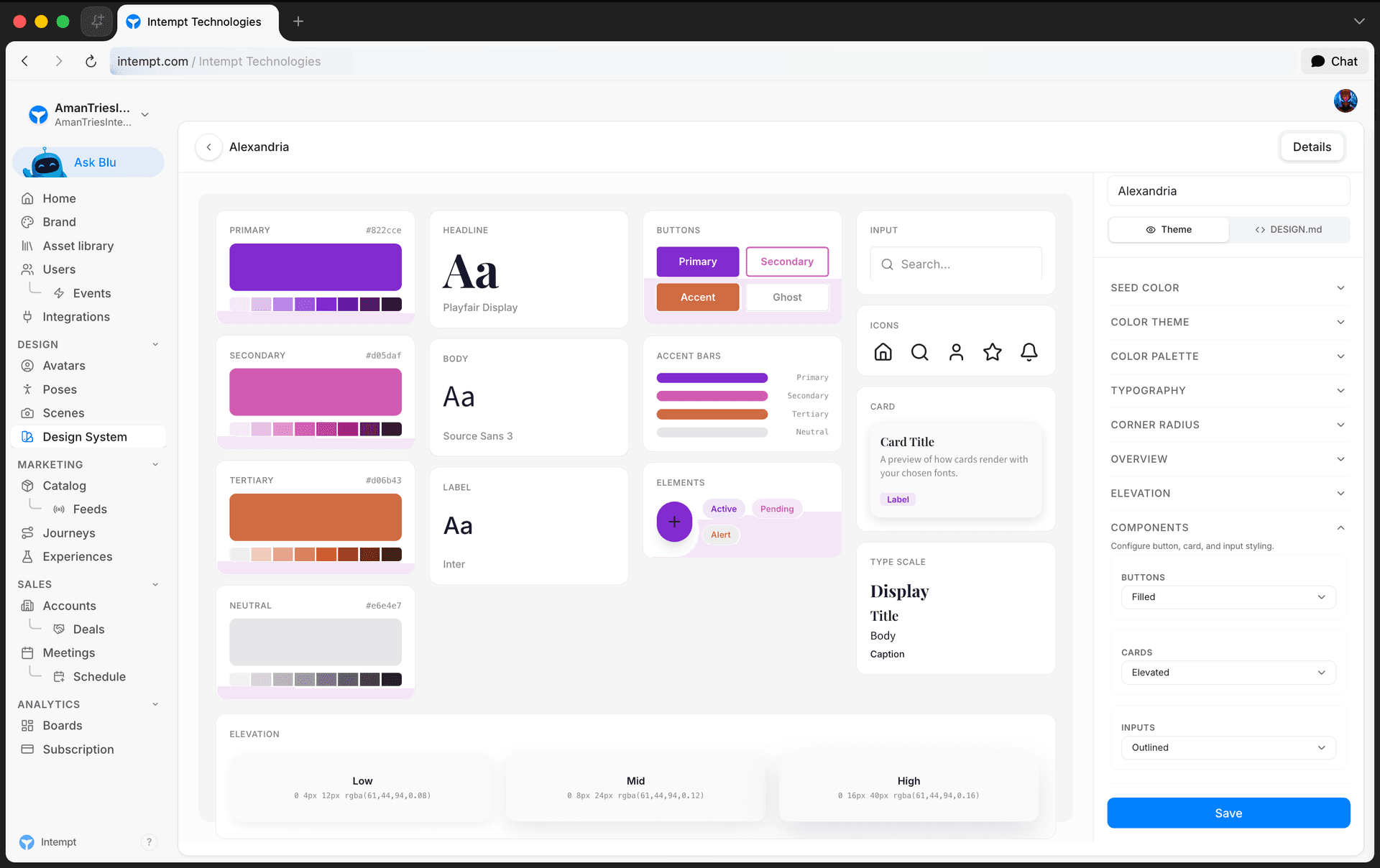
box-shadowvalue, and a usage note. Ships with three defaults: Level 1 (cards, dropdowns), Level 2 (modals), and Level 3 (popovers). Add levels freely with Add Level; the trash icon next to each one removes it, as long as at least one level remains. - Components. Three single-select fields: Buttons (Filled or Outline), Cards (Elevated, Bordered, or Flat), and Inputs (Outlined, Underline, or Filled).
📘 Good to know
Three of those options aren't confirmed to save correctly yet: Buttons' "Outline," Cards' "Bordered" and "Flat," and Inputs' "Underline" don't match the value the backend expects for that style. The editor lets you select them, but what happens after you save one hasn't been verified end-to-end.
Saving your changes
Once you've changed a field, a bar appears at the bottom of the sidebar with Discard and Save. Saving a custom design system updates it in place. Saving a preset instead creates a new custom design system, as covered in How it works above.
Use cases
- Starting from a brand's primary color. Set the seed color to your brand's hex, then pick a color theme to generate the rest of the palette instead of choosing all four colors by hand.
- Locking in an exact palette. Override each of the four palette roles individually when a brand's guidelines specify exact hex values rather than a generated theme.
- Matching a brand's type hierarchy. Set Headline, Body, and Label to different font families when a brand's guidelines call for a distinct display font versus a body font.
- Adjusting shadow depth for a flatter or more layered look. Edit the Elevation levels' CSS values, or add a fourth level, when the default three-level shadow scale doesn't match a brand's visual style.
- Building on a preset without losing the original. Remix a built-in preset into a custom design system, then adjust only the fields that need to change.
- Starting from an existing brief. Upload a DESIGN.md file instead of describing colors and type from scratch in chat.
Where to go next
Design Systems Overview
Design System is Intempt's reusable visual style library: seed color, typography, corner radius, elevation, and component styling, previewed live and applied wherever a design is picked.
Asset Library Overview
The Asset library is the shared catalog of every content asset your campaigns use, pinned at the top of the left sidebar.