
Creating an insights report
Insights reports plot trends and distributions for events or segments, at the user or account level, with breakdowns, filters, formulas, and attribution.
Overview
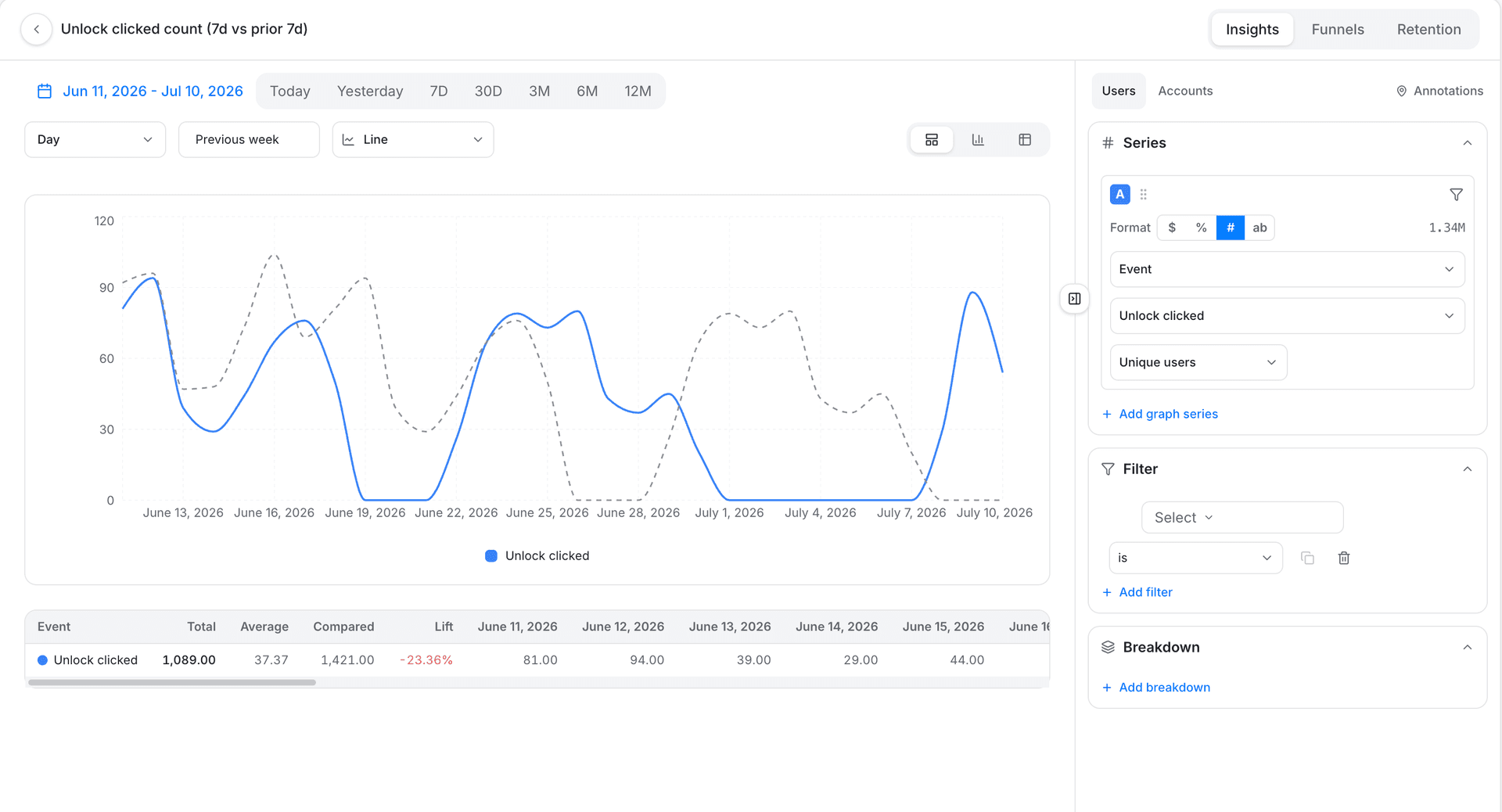
An Insights report plots how an event, a segment, or an attribute's values change over time, or breaks them down by group. Use it for any question that isn't about a step-by-step sequence (that's a Funnel) or about users coming back over time (that's Retention).
Use cases
- Activation. How is weekly active users changing over time?
- Frequency. How often are users getting value, on average?
- Distribution. What's the breakdown of users across regions or devices?
- B2B adoption. How many distinct accounts are active, not just individual users?
- Revenue per event. Sum a price attribute across an event instead of just counting occurrences.
Quick start
- Open the Analytics group in the sidebar and click Boards. Click Create board, pick Insights, then click Continue.
- Pick a profile: Users for individuals, or Users, by account if you care about companies or teams instead.
- Add an event or segment to analyze.
- Choose an aggregation, Total events is a safe default if you're not sure.
- Optional: add a filter to narrow it, or a breakdown to split the chart by group.
- Review the chart. Switch to table view, or try a different chart type, if you want a different read on the same data.
That's a working Insights report. The sections below cover every option in more depth.
Building it step by step
Choosing what to analyze
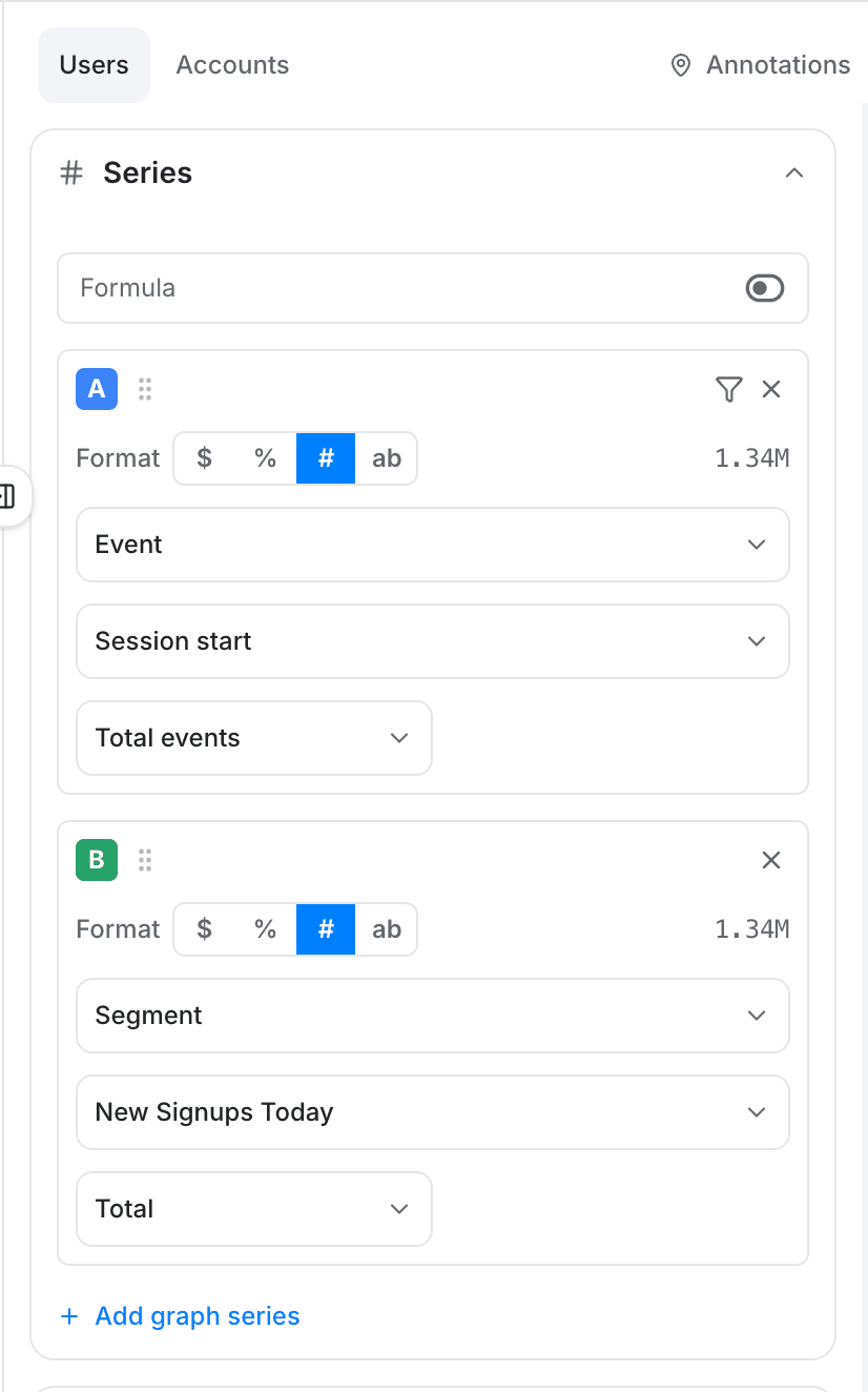
Pick a profile for the report: Users analyzes individual, identified or anonymous users. Users, by account aggregates the same data by the account (company or team) a user belongs to instead, useful for B2B products where you care how companies use your product, not just individuals.
Then pick what each series measures:
| Attribute type | Description |
|---|---|
| Events | Analyze the events tracked in your website or app. |
| Segments | Analyze membership trends in a segment. |
Choosing an aggregation type
| Aggregation | What it measures |
|---|---|
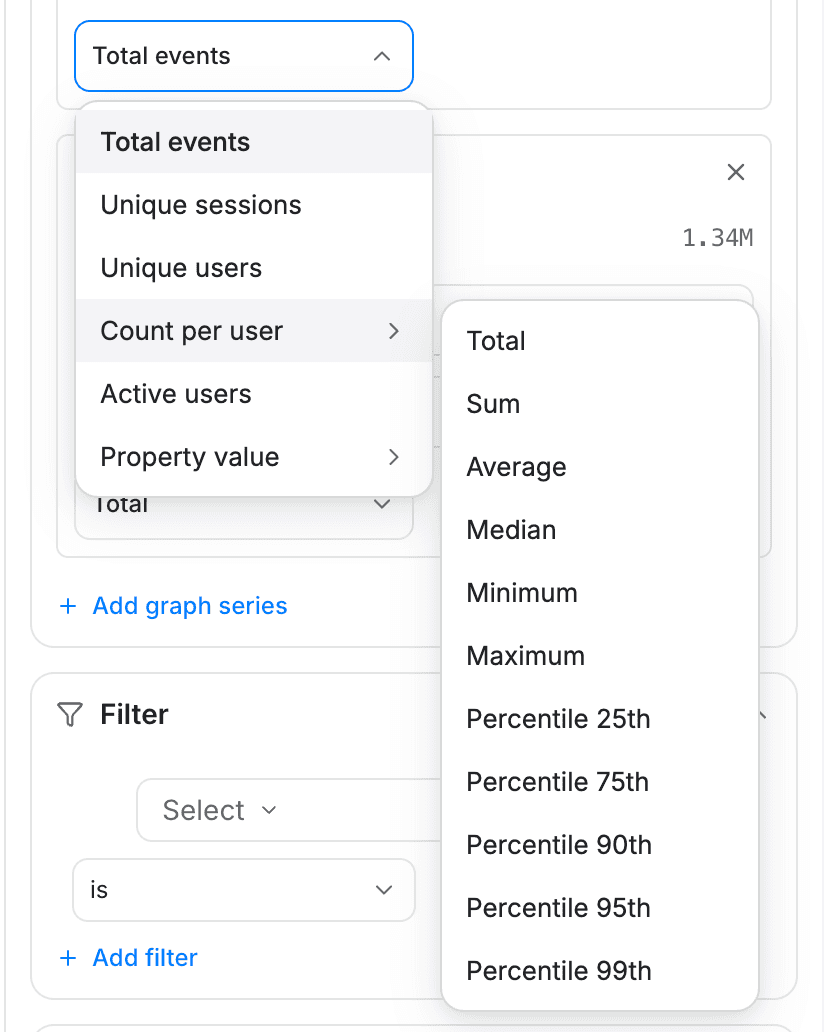
| Total events | The total number of times the event occurred in the period. |
| Unique sessions | The number of distinct sessions in which the event occurred. |
| Unique users | The number of distinct users who performed the event at least once. Labeled "Unique accounts" on an account-level report. |
| Count per user | The event's occurrences per user. Labeled "Count per account" on an account-level report. |
| Active users | Distinct users who performed the event within the report's active-user window (for example, the last 7 or 30 days). Labeled "Active accounts" on an account-level report. |
| Property value | An aggregation of a numeric event attribute, using a function below. |
💡 Good to know
The Active users window replaces separately tracking "monthly active users" or "weekly active users" as distinct metrics, pick the window that matches the question instead.
Property value functions
When a series uses Property value, choose a function to combine the attribute's values: Total, Sum, Average, Median, Minimum, Maximum, or a percentile (25th, 75th, 90th, 95th, 99th).
💡 Good to know
Property value aggregation only works on numeric event attributes.
Filters, breakdowns, and attribution
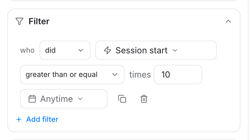
- Inline filters. Click the filter icon next to an event to narrow that series to a subset of events based on its attributes, for example only
pageviewevents for a specific URL. - Global filters. Apply a filter to every series in the report at once, combined with AND or OR. A global filter can reference any attribute seen on at least one of your events; an event missing that attribute is excluded rather than matched.
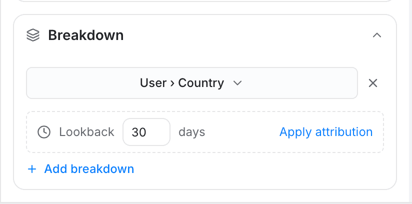
- Breakdowns. Split the report's graph into one line per value of an attribute, event property, or segment, up to two breakdowns at a time.
- Attribution. Inside Breakdown, click Apply attribution to credit a conversion to a specific touchpoint instead of just counting raw events. See Using attribution models for how the models and lookback window work.
Multiple series and formulas
Click Add graph series to track a second event on the same report, useful for comparing two events over the same period. Duplicate a series (with its filters) instead when you want to compare the same event under slightly different conditions.
Enable Formula mode to combine series with basic math (+, -, *, /) and series letters (A, B, C...). For example, A / B plots series A divided by series B at each point in time; multiply by 100 to show a percentage. With a formula enabled, only the formula's result is charted, not the individual series.
Reading the results
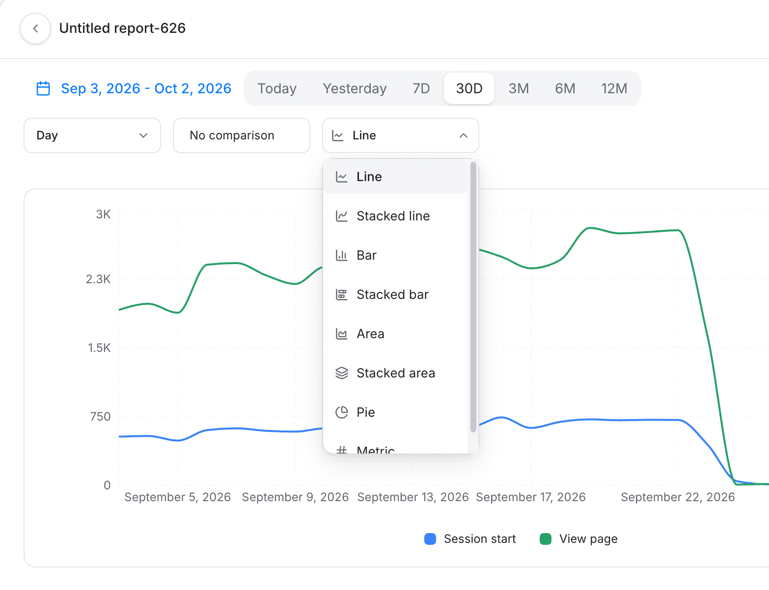
Once at least one series is configured, the chart and table render. See Insights data visualization for every chart type, the date range and comparison controls, and the table view.
Where to go next
- Analytics for what reports and dashboards do and which report type to reach for.
- Insights data visualization for chart types and display controls.
- Using attribution models for crediting conversions to the right touchpoint.
- Creating a funnel report to measure step-by-step conversion instead of a trend.
- Creating a retention report to measure return behavior instead.
Introduction to Analytics
Analytics turns the events you track into reports and dashboards: build Insights, Funnel, and Retention reports on user or account behavior, then combine them onto a dashboard to monitor your KPIs.
Insights data visualization
Every option for controlling how an Insights report displays its data: date range, comparison, grouping, chart type, legend, and table view.