
Insights data visualization
Every option for controlling how an Insights report displays its data: date range, comparison, grouping, chart type, legend, and table view.
Overview
Once a report is measuring the right thing, these options control how it's displayed: date range, comparison, grouping, chart type, legend, and table view. For building the report itself, see Creating an insights report. For how events get aggregated and broken down, see Event Tracking Reference.
Date range
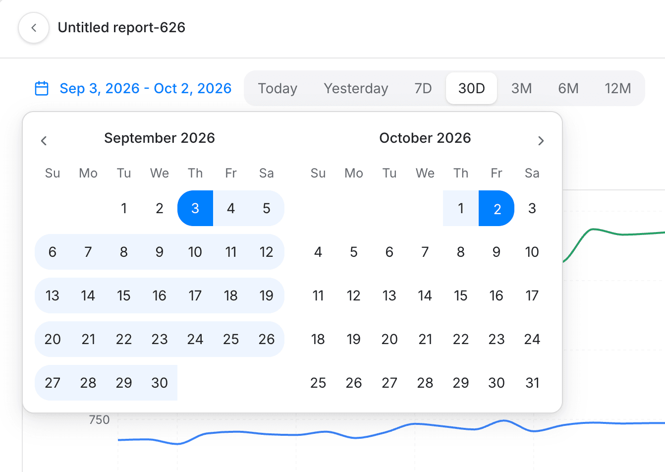
The date range sets the absolute bounds for which events a report includes. All dates and times reflect the project timezone.
| Tab value | Meaning | Description |
|---|---|---|
| Custom | Custom | Select a specific date range, for example May 1 - May 31. |
| Today | Today | The current, incomplete day up to the current second. |
| Yesterday | Yesterday | The whole of the previous day, midnight to midnight. |
| 7D | Last 7 days | The last 7 days plus the current incomplete day. |
| 30D | Last 30 days | The last 30 days plus the current incomplete day. This is the default on most reports. |
| 3M | Last 3 months | The last 3 months plus the current incomplete day. |
| 6M | Last 6 months | The last 6 months plus the current incomplete day. |
| 12M | Last 12 months | The last 12 months plus the current incomplete day. |
Compare
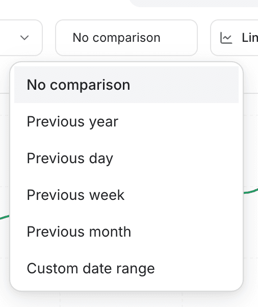
Compare overlays data from a previous period onto the current one. The available comparison periods depend on the report's Group by setting: previous day, week, month, or year, plus a custom comparison range.
The lift shown for a comparison is colored green when the current period is up and red when it's down.
💡 Good to know
Compare isn't limited to comparing against a fixed prior period. You can also use it to check a specific campaign's traffic against your normal baseline, or the same campaign one year apart.
Group by
Group by changes what counts as a single data point on the chart. For example, grouping by Week means each point on the graph aggregates one week of events using the report's chosen aggregation.
Available groupings: Day, Week, Month, Year.
Chart types
Six chart types plot every point in time; two, Pie and Metric, summarize the whole period as a single value instead.
| Chart type | Best for |
|---|---|
| Line (default) | A simple trend line. Good starting point for almost any question, and the clearest way to compare a few series over time. |
| Stacked line | Showing composition over time, each series' share of a combined total at every point, not just the overall trend. |
| Bar | Comparing discrete periods (day vs. day, month vs. month) rather than following a continuous line. Clearest with one series at a time. |
| Stacked bar | Comparing totals across categories period by period, each bar shows the combined total with every series' contribution inside it. |
| Area | Emphasizing volume. The filled area under the line makes a single metric's magnitude more visually prominent. |
| Stacked area | Cumulative growth. Shows how a total builds up across multiple contributing series as it changes over time. |
| Pie | Relative share across a handful of categories for one period, not a trend over time. |
| Metric | One number as a card, for a headline KPI. Pairs well with Compare to show the lift against a prior period. |
Legend
The legend lists one entry per series on Line, Stacked line, Area, Stacked area, and Stacked bar charts. Click an entry to hide or show that series on the chart; hidden entries dim to indicate they're off. If a report has more than 6 series, the legend groups the rest behind a "+N more" toggle.
Table view
The table shows each series as a row, with a Total and an Average column across the date range. When Compare is active, it adds Compared and Lift columns. Click the colored dot next to a row to hide or show that series on the chart, the same toggle the legend provides.
Putting it together
- Building a KPI-style dashboard widget. Pair a Metric card for the headline number with a Line chart for the trend behind it.
- Comparing a campaign against your baseline. Use Compare with a custom range to check a launch window against normal traffic.
- Auditing a stacked total. Use the legend or table view's row toggle to isolate one series at a time.
- Getting the exact numbers, not just the trend. Switch to Table view for the raw totals and averages behind the chart.
Where to go next
- Creating an insights report for the step-by-step report builder.
- Event Tracking Reference for how events get aggregated and broken down.
- Analytics for what reports and dashboards do and which report type to reach for.
Creating an insights report
Insights reports plot trends and distributions for events or segments, at the user or account level, with breakdowns, filters, formulas, and attribution.
Using attribution models
Which touch gets the credit when a deal closes, and why the answer changes the number. Set the attribution model on an Insights report and compare two.